Overview
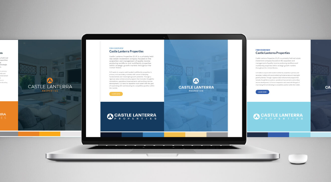
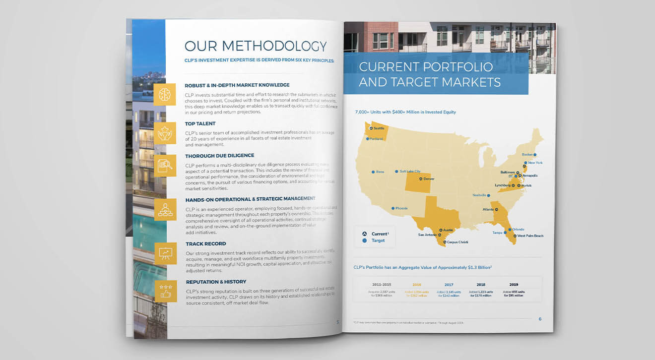
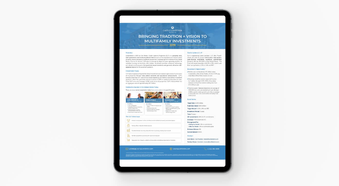
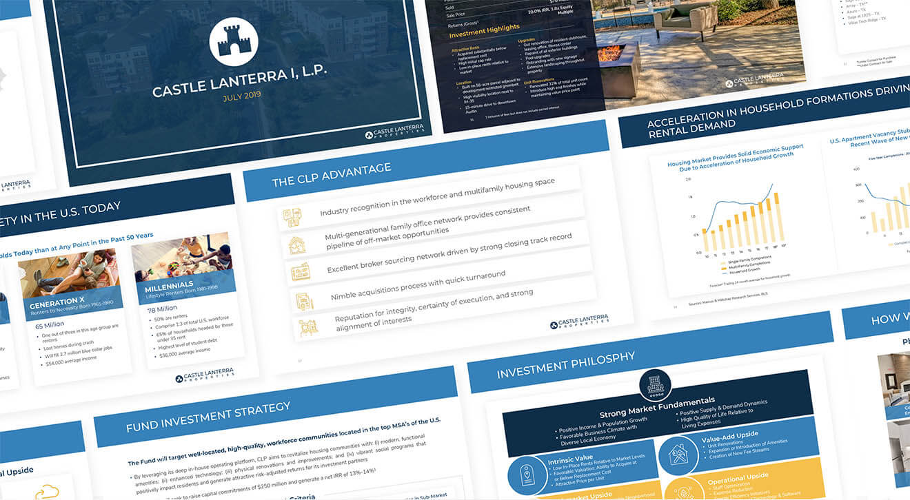
The members of Castle Lanterra Properties recognized their logo and branding needed a refresh and came to the antenna team for recommendations. Our design team got to work re-illustrating their existing logo, creating a more modern clean castle. In addition, a variety of color schemes and typefaces were explored, Our goal was to remove the parts of the brand there were holding it back and refine the current elements that neededThe Castle Lanterra Properties (CLP) team had an outdated corporate presentation in need of a major design overhaul. The Antenna Group design team had an open and honest discussion with the CLP team about not just the deck, but their overall brand direction. It was determined that, before doing the presentation design, it would be better to take a step back and rebrand the company. After a few rounds of logo and color palette refreshes, the new brand was ready to be put to the test. The presentation was the first successful application of the new brand. This inspired the team to have a one-pager and a corporate overview updated as well. cleaning up. A variety of other design elements such as a blue overlay were added to create visual interest across digital and print materials.


